In the world of graphic design and data visualization, choosing the right colors is crucial for creating visually appealing and effective designs. Gradient color palettes, in particular, not only add vibrancy to dashboards and charts but also enhance user experience. In this post, I’m excited to share my top 10 favorite gradient color palettes that […]
Tag Archives: data visualization
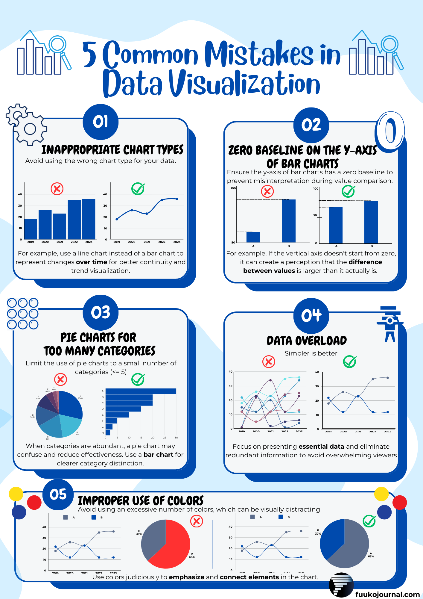
Greetings fellow data enthusiasts! As someone who has delved deep into the realms of Data Analysis, I’ve come to appreciate the delicate balance between science and art that is data visualization. With a wealth of experience sculpting dashboards that tell stories and reveal insights, I find myself returning to five fundamental principles whenever I embark […]


