
Office Productivity
My Top 10 Favorite Gradient Color Palettes
Jul
In the world of graphic design and data visualization, choosing the right colors is crucial for creating visually appealing and effective designs. Gradient color palettes, in particular, not only add vibrancy to dashboards and charts but also enhance user experience. In this post, I’m excited to share my top 10 favorite gradient color palettes that I frequently use in my personal projects. These color combinations not only help me create impressive designs but also bring freshness and professionalism to my dashboard and chart projects. Let’s explore and appreciate the beauty of these gradients!
#E43D00 and #FFE900
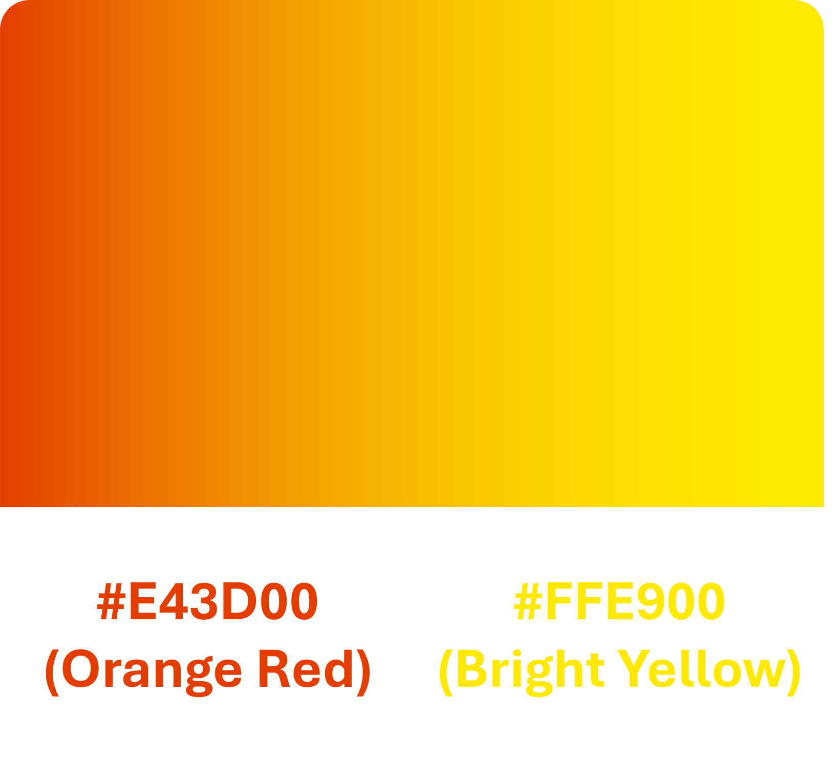
Known for its powerful combination of deep orange and bright yellow, this gradient brings energy and warmth. I often use this palette in designs that need a burst of energy and prominence, helping to highlight key elements in dashboards and charts.
#F02FC2 and #6094EA
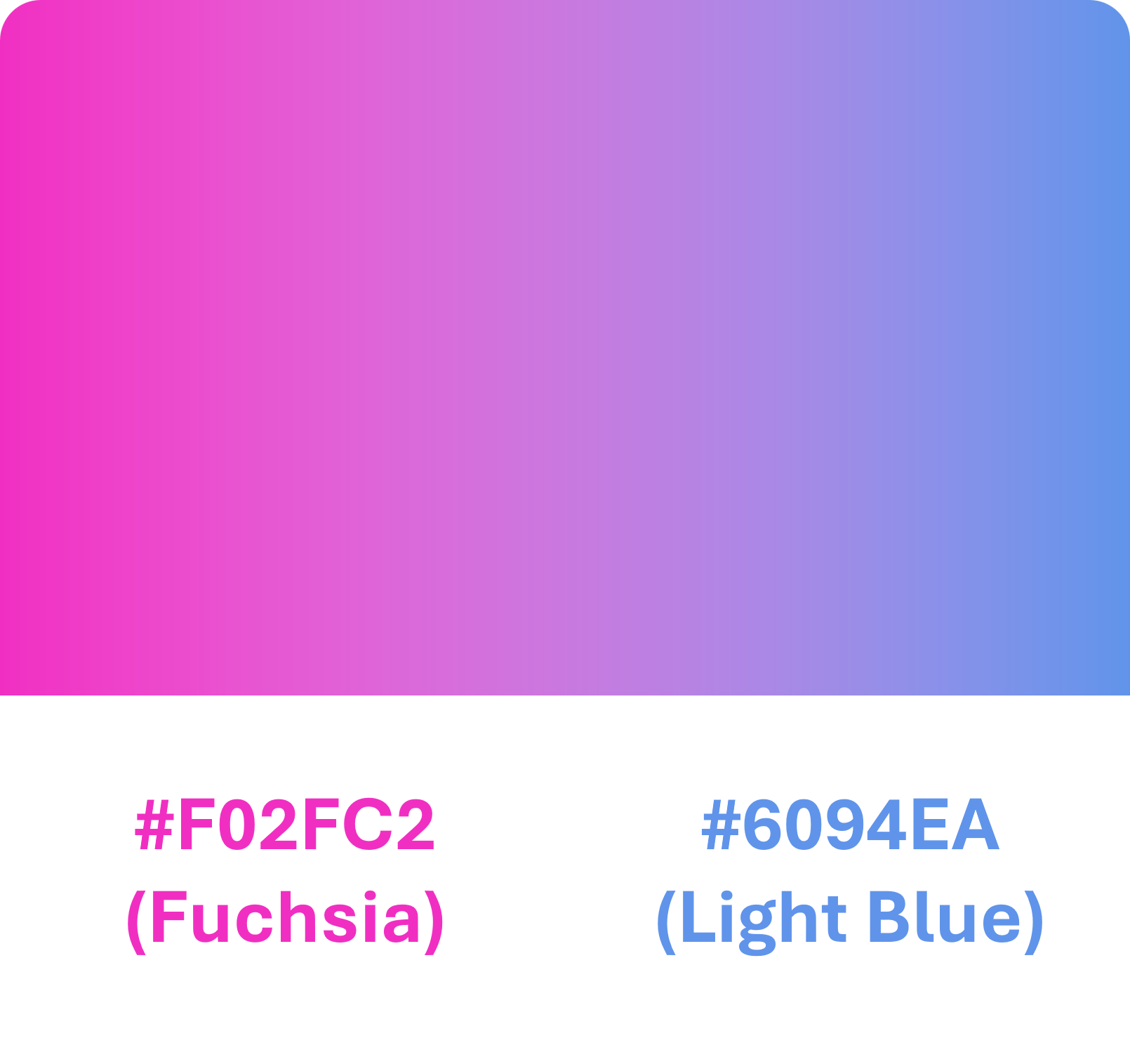
The blend of vibrant pink and blue creates a refreshing and engaging gradient. This palette is ideal for personal projects and chart designs, providing a modern and captivating feel.
#622774 and #C53364
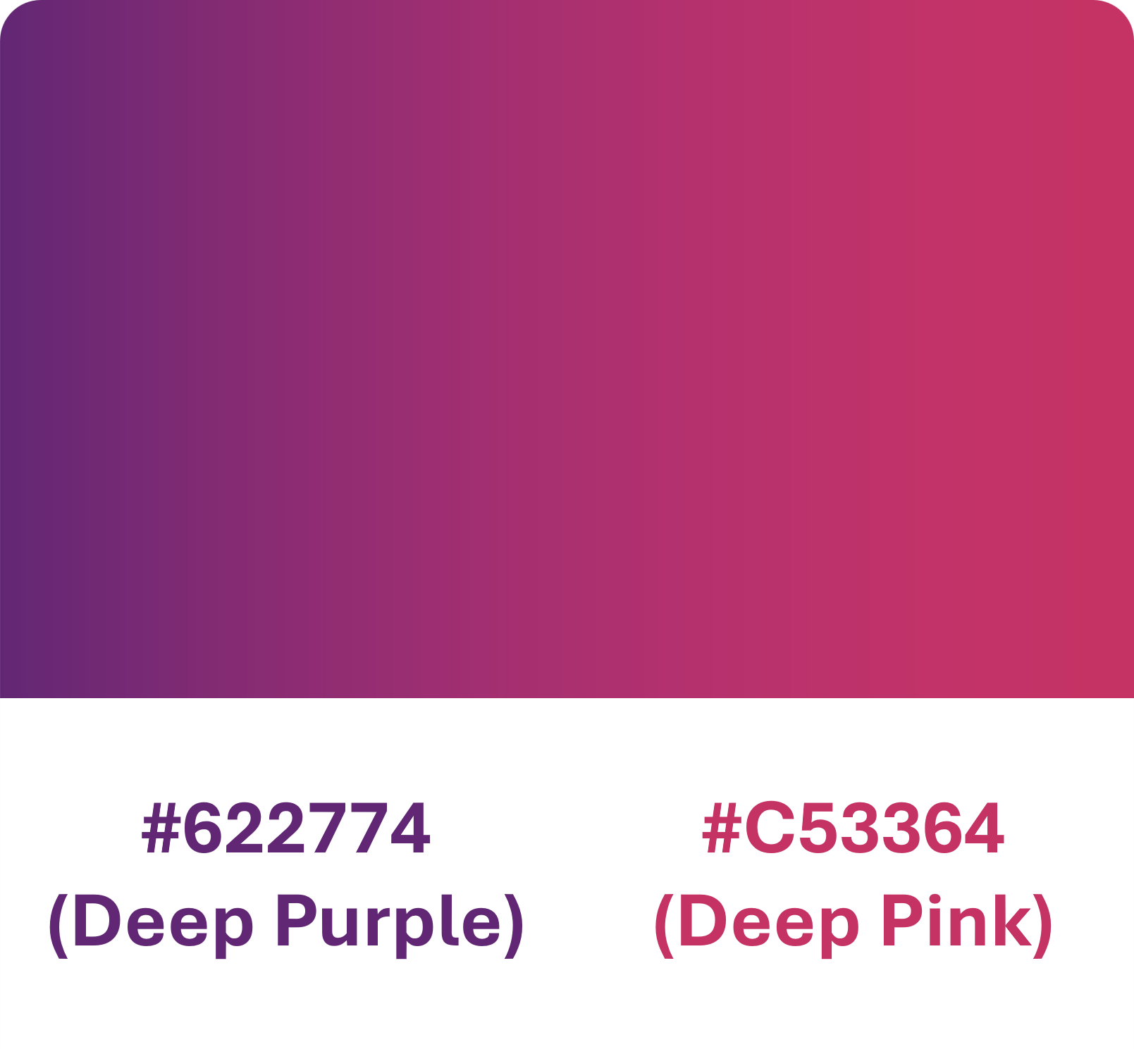
Combining deep purple with bright red, this gradient exudes a mysterious and alluring vibe. I like to use this palette in dashboard designs to create impactful highlights and convey a strong message.
#F54EA2 and #FF7676
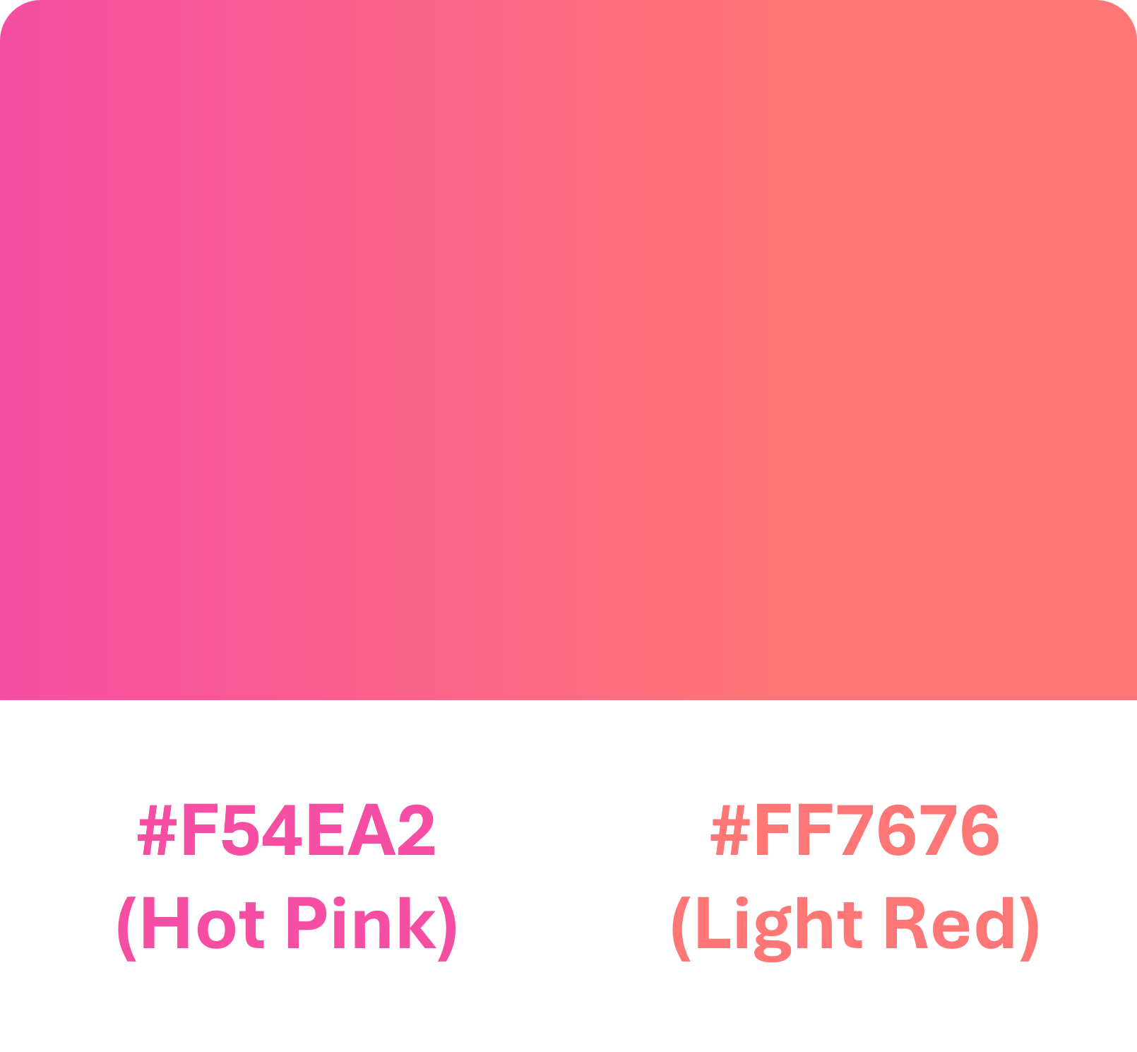
This gradient blends neon pink with light red, creating a cheerful and dynamic effect. It’s a great choice for charts that need extra liveliness and to draw attention.
#DA3068 and #14469F
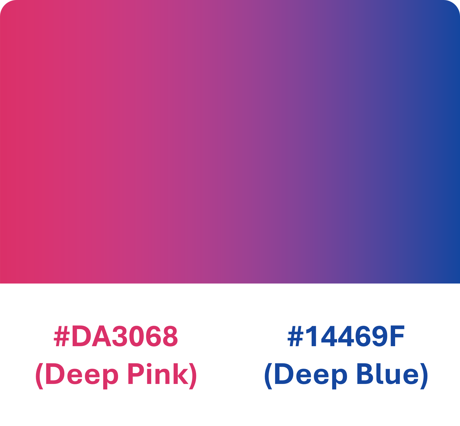
The combination of peach pink and dark blue offers a strong yet harmonious contrast. This palette helps create distinct contrasts in dashboard designs and personal projects, highlighting important elements effectively.
#17EAD9 and #6078EA
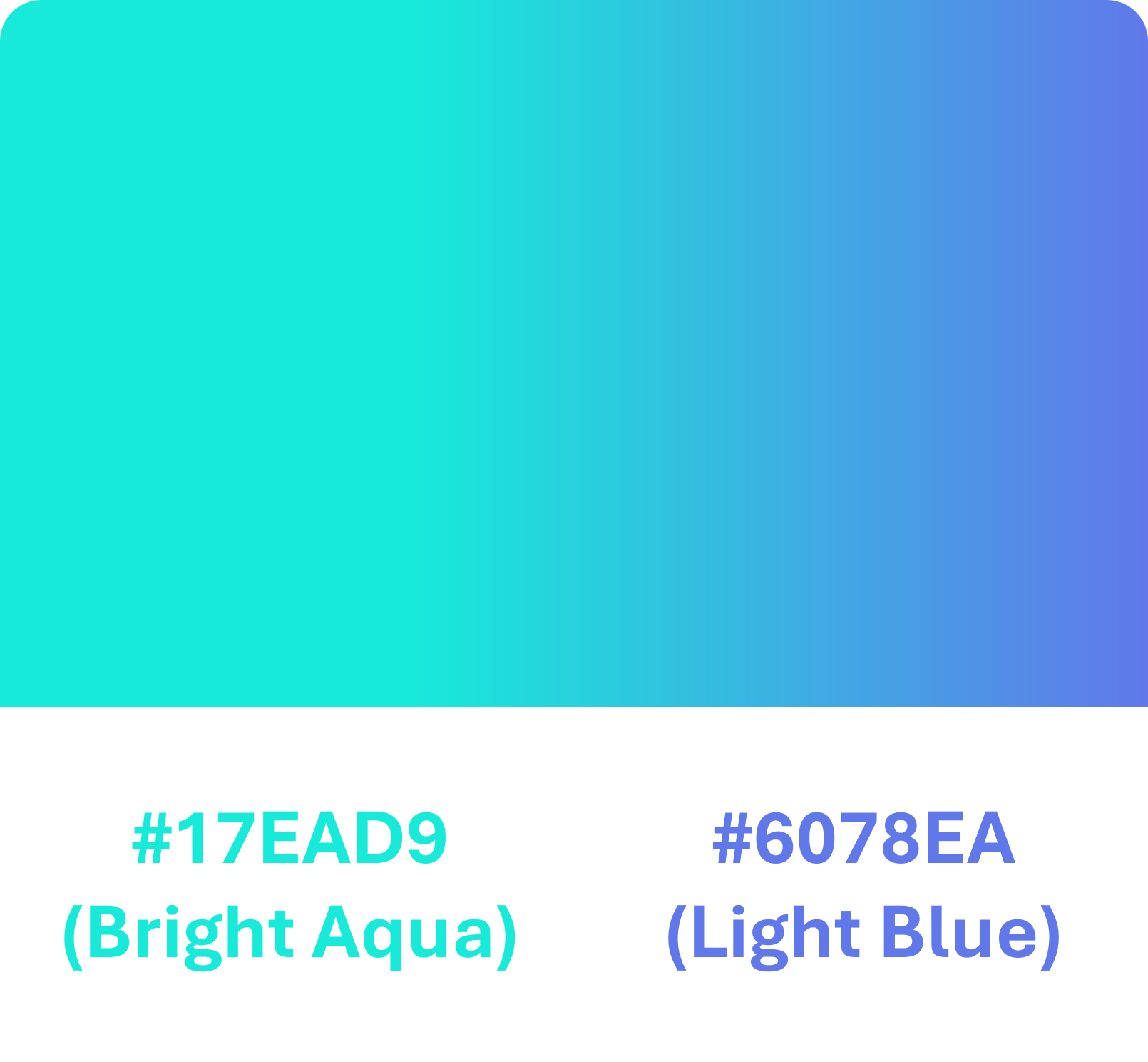
Blending light teal with bright blue, this gradient provides a cool and relaxing feel. I use this palette to add a gentle and professional touch to chart designs and dashboards.
#BCE7FC and #C491B1
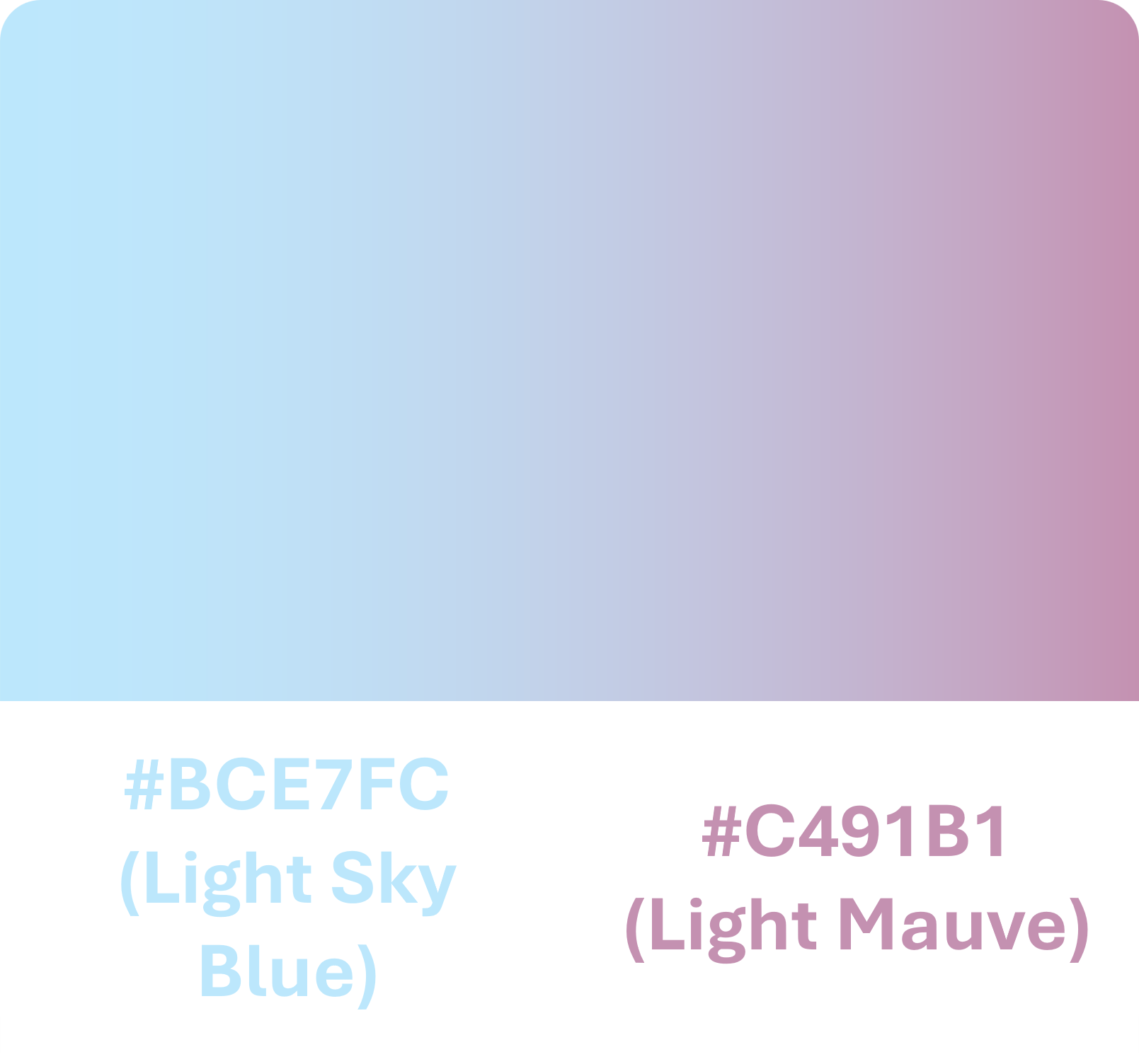
With a mix of light blue and peach pink, this gradient creates a gentle and pleasant feeling. It’s perfect for projects that need a soft and elegant touch.
#350068 and #FF6978
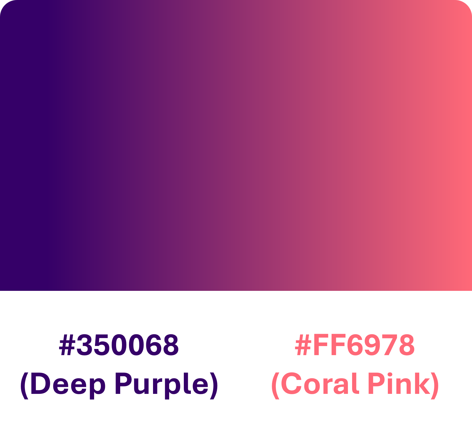
The contrast between deep purple and light red creates a bold and striking effect. This palette is often used to highlight important elements in dashboards and charts, making them stand out prominently.
#264653 and #2A9D8F
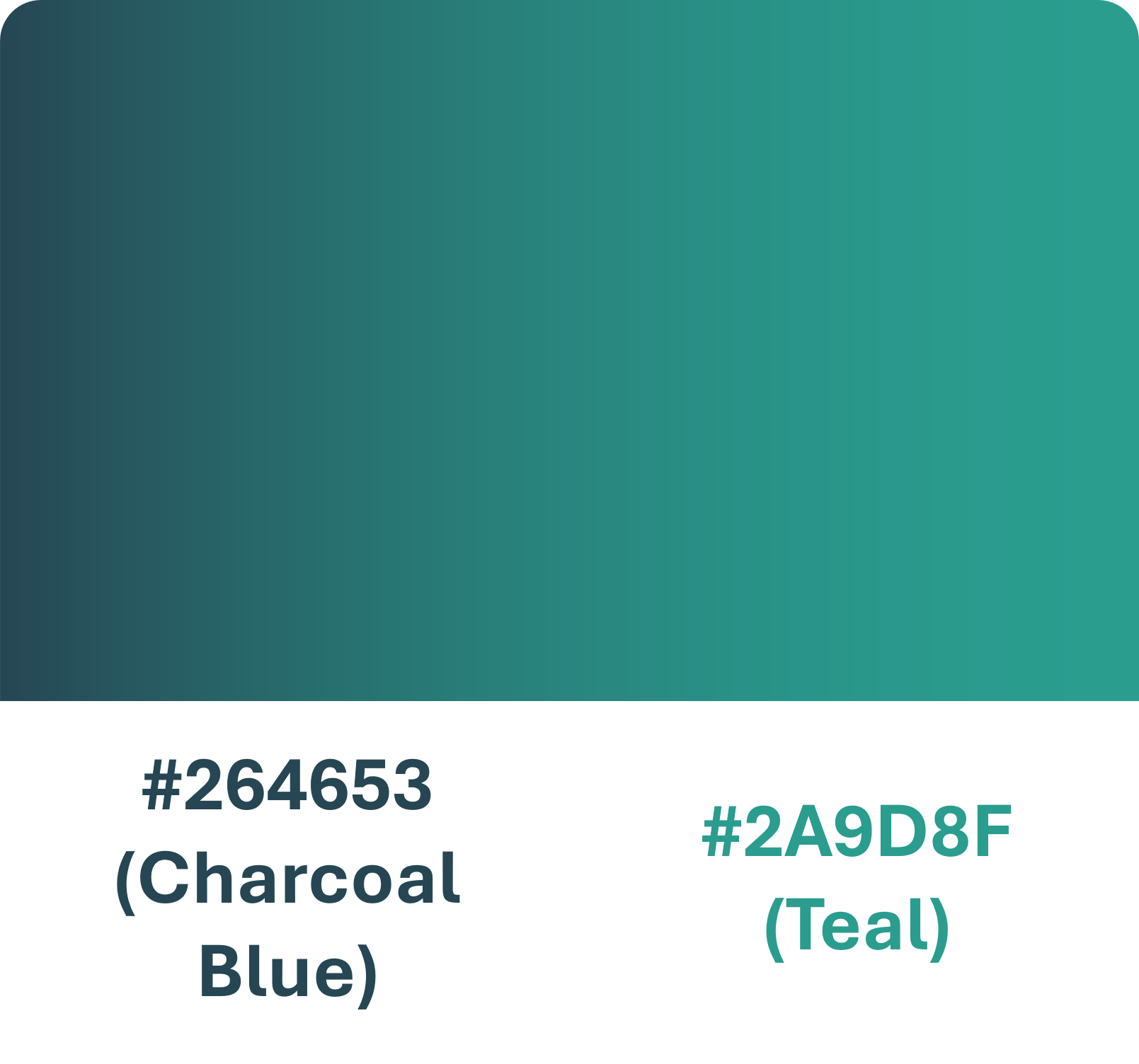
This gradient combines dark blue with teal, offering a fresh and natural vibe. I frequently use this palette to bring harmony and cohesion to designs and personal projects.
#022F40 and #38AECC
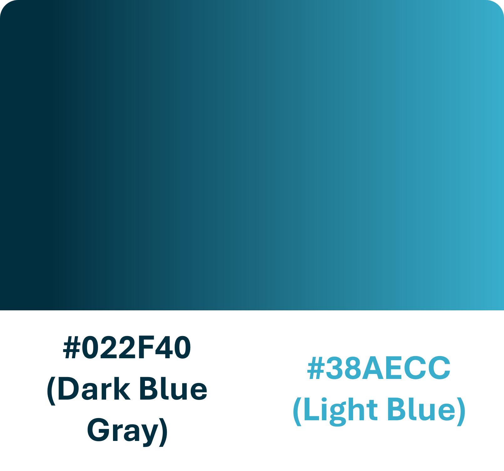
The blend of dark blue with bright teal creates a powerful and professional gradient. This palette is an ideal choice for dashboard and chart designs, adding a sophisticated and modern touch.