
Data Analysis
Unlocking the Power of Data Visualization: 5 Common Mistakes in Data Visualization
Nov
Greetings fellow data enthusiasts! As someone who has delved deep into the realms of Data Analysis, I’ve come to appreciate the delicate balance between science and art that is data visualization. With a wealth of experience sculpting dashboards that tell stories and reveal insights, I find myself returning to five fundamental principles whenever I embark on this journey.
My Data Odyssey:
Allow me to introduce myself. I’m Thao (aka Fuuko), a seasoned data analyst with a passion for transforming raw data into meaningful narratives. Over the course of my career, I’ve had the privilege of constructing dashboards that not only unravel the intricacies of data but also speak a language that resonates with decision-makers.
The Five Pillars of Successful Data Visualization:

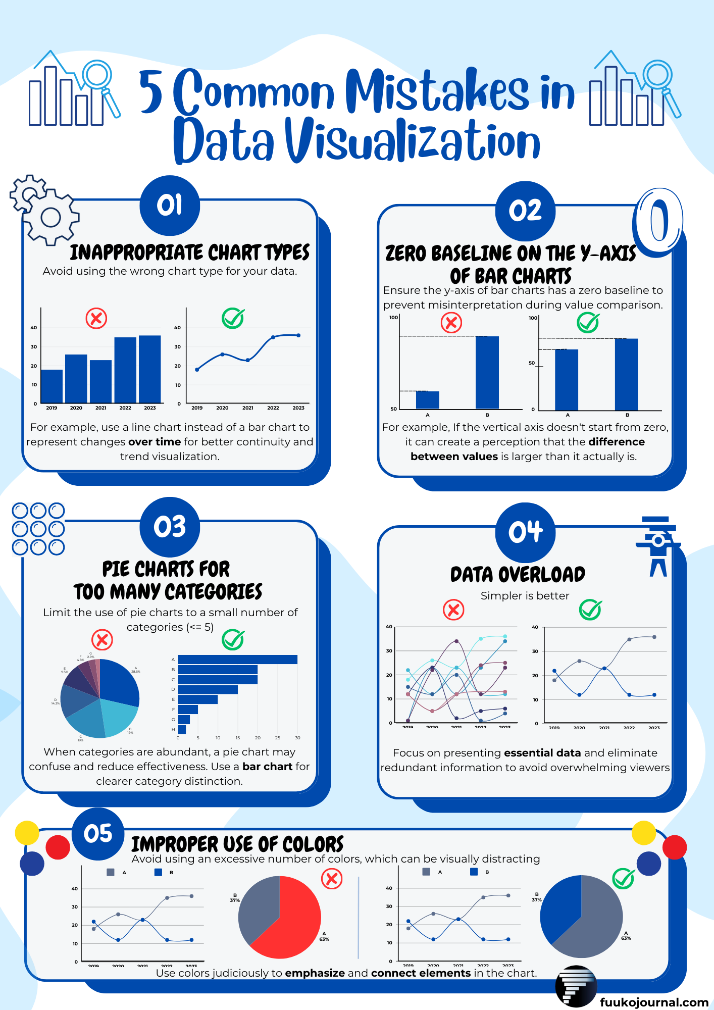
1. Inappropriate Chart Types: A Brushstroke Misplaced
Picture this: you’re an artist selecting the perfect brushstroke for a masterpiece. Similarly, choosing the right chart type is pivotal in the data visualization process. When illustrating changes over time, the misuse of a bar chart can obscure trends. Instead, opt for a line chart to weave a continuous narrative that unveils evolving patterns.
2. Absence of a Zero Baseline: The Crux of Comparison
Every good story has an introduction. In data visualization, the zero baseline on the y-axis is the introduction that anchors comparisons. Omitting this baseline is akin to starting a tale in the middle, leaving viewers to decode a narrative without context. Ensure your bar charts start at zero for accurate and meaningful comparisons.
3. Overreliance on Pie Charts: The Slicing Dilemma
Pie charts, while effective in moderation, lose their charm when dealing with a multitude of categories. Think of slicing a pie into countless slivers—clarity is lost. Enter the bar chart, a hero that thrives in conveying clarity amidst complexity. Opt for it when faced with a diverse array of categories.
4. Information Overload: Less is More
In our quest for comprehensive data representation, the temptation to overwhelm charts with excessive information is ever-present. However, in the realm of data visualization, less is often more. By focusing on essential data points and eliminating redundancy, your charts become powerful vehicles of communication rather than sources of confusion.
5. The Palette Predicament: A Symphony of Color
Color is a language, and like any language, it requires finesse. The judicious use of colors can emphasize key elements and establish connections within the chart. On the flip side, an excess of colors can turn the visual experience into a distracting cacophony. Striking the right balance ensures your audience’s attention is precisely where it should be.
Conclusion:
In conclusion, data visualization is not merely a science but an art form that demands both precision and creativity. Through the lens of my experience, these five principles have become the compass guiding me through the dynamic landscape of dashboard creation. As we collectively navigate the world of data visualization, let’s continue refining our craft and sharing insights to amplify the impact of our data stories. Your journey in data storytelling awaits—seize it with clarity and creativity! 📈📉